Week 1
In studio section of the lesson we went through our tool kits and experimented with some drawing and shading techniques.
 |
| Conveying light and shadow |
 |
| Quick sketches of chair |
 |
| Chair sketches without looking and with left hand |
 |
| Learning positive and negative space |
 |
| A colour drawing of the person opposite without looking |
Observing and documenting the site
Out at the site we had great discussion in our group. We walked around the site (Group 2) grid location.

Information we came up with about our site:
· Width of main walkway/thoroughfare through our grid location = 3000mm
· Foyer/entrance = 4800mm (w) x 105040 (l)
· Floor to base of step = 2410 mm
· Step height = 120 mm
· Step length = 305 mm
· Length of top of the patio/top of stairs = 1535 mm
· Building elevation (distance from ground to first floor) = 550mm
· Bin section = 930 (w) x 150 (h) x 4360 (l)
· Garden bed outside student accommodation building = 1800 mm (top one) and 840 (bottom one) mm
Answers to Activity B Questions:
What buildings or structures are on the site? Student accommodation, UNSW Hall
How many?
How big are they? Medium density high rise e.g. student accom is approx. 5 stories
Where do we get into the buildings? Student accom can be entered from the walkway and UNSW hall presumed entrance is on otherside if the building?
What other openings are there (for example, windows)? Many windows on both buildings. Automatic doors on student accom (must have security card to enter however).
Are they multilevel? (if so, how do we get from one to the other?) Yes. The two buildings are no connected – they’re separated by the walk way.
How far apart are they? Quite a few metres. Approx 20m?
What natural elements are on the site? • Trees, shrubs, waterways, rocks.
Material Elements found on site Concrete, wooden fences, grass, flower beds, glass windows, steel columns, aluminium window frames, bricks on UNSW hall building
What are the manmade elements composed of? e.g. Brick, Steel, Glass, Sandstone etc. How do people use the site? residential, as a thoroughfare, leisure (greenspace), variety activities/meetings (UNSW Hall)
Is there a thoroughfare? Yes
Is there a contemplative space? Yes – perhaps the greenspace the the UNSW Hall uses
What are the different intended or unintended functions of the site? (for example, do people use the space to rehearse dance routines, or smoke cigarettes, or simply sit on the grass) Thoroughfare could be used as a leisure space e.g. In hot weather it is shaded and cool due to position and concrete. Similarly, the greenspace could be used for small sporting activities or for relaxation.
What is the orientation of the site? At midday the greenspace was in full sun and the thoroughfare and southern facing student accommodation was in full shade.
Where is North, South, East and West? Standing in the middle of our grid reference: Student accommodation is to the north, Whitehouse to the East, UNSW Hall/greenspace to the South and lower campus and further Student accommodation buildings to the west
Where is the Sun at 3 different times in one day (morning, midday and afternoon)?
Where are the shadows at these times?
How do we record or communicate a 3D space or a physical site? Different ways of recording the site.
Recording the site
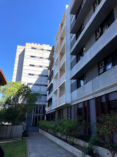
Photography of our site:
Sketching the site:
 |
| Attempt at a blind contour drawing of the site |
 |
| group members' visual diary - grid location measurements |
 |
| group members' visual diary - grid location measurements |
 |
| group members' visual diary - grid location measurements |
 |
| My visual diary - different perspectives of our grid location |
 |
| My photoshopped image. |
Week 2
In Studio Activities
My data set = 'Transport to UNSW'
See below my 3 words and their correlating images.
 |
| Convenience |
 |
| Transference |
 |
| Infrastructure |
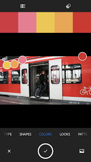
See below 'Adobe Capture' swatches for each image.
 |
| The infrastructure image being analysed by adobe capture |
 |
| 'Swatches' of the infrastructure image |
 |
| 'Harmonies' of the infrastructure image |
 |
| Convenience image being analysed by adobe capture |
 |
| 'Swatches' of convenience image |
 |
| 'Harmonies' of convenience image |
 |
| Transference image being analysed by adobe capture |
 |
| 'Swatches' of transference image |
 |
| 'Harmonies' of transference image |
It can be concluded the colour scheme based from the above swatches from my 'transport' based images are red and yellow, with a touch of muted blue tones that are generally warmer based. Hence, my infographic should reflect such findings.
On site activities
1. Firstly we went to our grid location and found examples of design elements and principles that are common in the Built Environment.
See below a photo of each design element/principle deliberately used in our site.
 |
| Lines |
 |
| Alignment - The stair way aligns with the door which then aligns to allow access to walkway inside |
 |
| Shapes |
 |
| Direction of lines - horizontal fence elongates the area/structure, creating sense of more space |
 |
| Size/scale - comparing the buildings and walkway area |
 |
| Texture - different materials are used meaningfully in this design |
 |
| Colour - Small intense sections colour are significant despite their size |
 |
| Proximity - the end of this one building and the beginning of another is a proximity design feature |
 |
| Balance - width of two columns apart allows enough space for design of the stair to be effective |
 |
| Repetition - storeys match each other |
 |
| Space |
Week 3 - Orthographics
This week we learnt about Standards and Conventions, Plan, Section, Elevation, Scale, Orthographic Views.
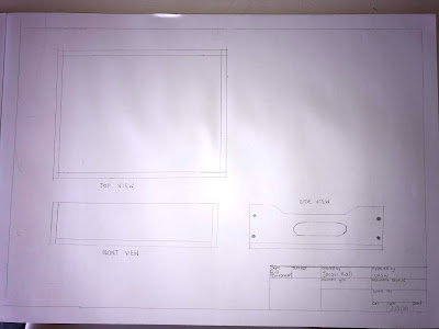
In the studio we drew the box we made in the Design Future Induction in a third angle projection format, making sure to think about the scale. I chose a scale of 1:2 as this fit best on my page.
By visiting the site at different times of the day we found it was used for different user experiences. In the morning - mainly students as they make their way into Uni from High Street (access to buses or parking) or out of their on-site accomodation. UNSW Staff were also found to be using it to get to work or perhaps as a pathway using it to get from A to B.
 |
| High St |
The pedestrian traffic was noticeably higher on the northern path way of the UNSW Village towers. This was due to proximity to High Street, a larger number of accomodation entrances leading onto this path and it formed part of the direct walkway from lower campus to mid campus/Colombo house (used for lecturers and some accomodation). During the middle of the day the area had a lot more use. Due to the location of The Whitehouse on the Eastern perimeter of our site, many people (students, staff and possible members of the public) were using the paths in our site to access the cafe. Students were also using it to enter their apartments (possibly to go home for lunch). During the few hours over lunch user activity was relatively constant.
 |
| The White House |
 |
| Colombo House |
 |
| Tower 10 accomodation entrance |
In the afternoon the user experience was similar to the morning, with most users walking through the site in order to leave the uni (via High St for buses and parked cars) or go into their apartments in the UNSW Village.
Throughout the day UNSW employed security was also present on our site. This presence did not seem to increase or decrease over the day, it was seemingly random. Security often drove a golf buggy through the site.
Drawing my plan
Using illustrator I attempted to draw my plan. Our site measured 40 x 40 metres. I decided on 1:200 as my scale. The shadows were a bit tricky as North is exactly vertical on the site, meaning the shadows would be drawn downwards - tending south of the buildings. Russell advised that it is okay to change the angle, so I made it a 45 degree angle to exaggerate the shadow. The main buildings can be seen highlighted in pink. The different colour ribbons represent different paths/uses by pedestrians in the site. The changing thickness shows the changing traffic densities.
The final product:
Week 4 - Analogue and Digital Drawing
This week, we learnt about combining hand drawings and digital on a tech based platform. We heard from a guest lecturer who explained his work with Burning Man. It was really cool to see how design and architecture are used at a city like festival and how these this forms the basis the festival with collaboration, expression, work and fun all combined together.
This week we had to select our 'best' works from previous weeks and combine in a single image. We found it hard to define 'best'. My group came to the conclusion this brief meant to visually show our journey from week 1 to week 4, and how our weekly works came together as we worked as a group. Almost depicting a timeline or collage of our efforts over the past month.
It was great working with others from different disciplines and meeting new people. This assessment definitely pushed us, and me (as a city planning student) out of our comfort zones. Forcing me to attempt tasks I would normally stray away from! As a result I have gained new skills and learnt how to work with others, despite our differing interests.
Here are the final submissions!


No comments:
Post a Comment